In our previous post, Improve the performance of your Amazon Brand Store, we focused on giving you recommendations on the structure and the most interesting modules you need to work on to encourage performance and avoid bounces in your Brand Store. Now, we are going to give you tips regarding the content you should include and how to improve the design, in order to increase interest and usability.
Gaining the trust of customers by offering quality content
The Brand Store is the representation of your brand identity on Amazon, so, in order to raise the interest of buyers and generate trust and loyalty, we recommend you some tips that you can apply:
- Our first recommendation is that the Amazon Brand Store should only include high quality creativities and design that is in line with the essence of the brand. Avoid images that do not match Amazon’s predetermined sizes or those that look pixelated.
- In 2021, 69% of store visits were made from a mobile device, so adapting your store to both desktop and mobile is essential to improve the user experience. Now you can quickly check the different views of your Store for mobile or desktop devices easily within the creation platform.
- It is also important to write a good content in your Store, since it will help to build confidence in buyers, creating an immersive shopping experience. The grammar and spelling, sentence structure, legibility and CTAs (call to action) are the main elements to consider at this point.
- Use the Creative Resource Library app, where you can store, organise and reuse your brand content, mainly logos and images. Thanks to this functionality, you can easily edit your Brand Store and adapt the design to events such as Black Friday or Prime Day, since you will have all the creatives stored in one place.
- Another feature to enrich the user experience will be the use of Posts (beta version available only in the USA). All posts will be displayed in your Store, allowing users to buy the “posted” products after navigating through this visual content. We recommend you post regularly to keep buyers interested.
Improve the design of your Store
Choose your Amazon Brand Store design wisely and make sure it is intuitive for the user. Take advantage of the Brand Store’s functionality to teach shoppers more about your brand by mixing static designs, such as images, with a slightly more dynamic design, such as videos, background videos or interactive shopping images.
This extra content provides additional value to the user and generates trust in the Brand, so, in general, the more time the user spends browsing your shop, the more interested they will be and the higher the probability of conversion.
Here are some tips on how to generate this effect in your Store:
- Standard videos: Include videos mentioning, for example, your brand philosophy and differentiating values. You can also upload videos to provide more information about your top products or new launches. To guarantee a good user experience, it is important that the videos have a high quality. It is also recommended to avoid videos that are not too long as users could lose interest, as well as not using too many videos on the same page so that the Store does not take too long to load.
- Background or looping videos: Background videos are sequences of a few seconds that run automatically when you enter the Store and are displayed in the background without sound, playing in a loop. You can play with this type of video to capture the user’s attention in a strategic way at a specific place in your Store, such as a differentiating value of your brand or a new launch.
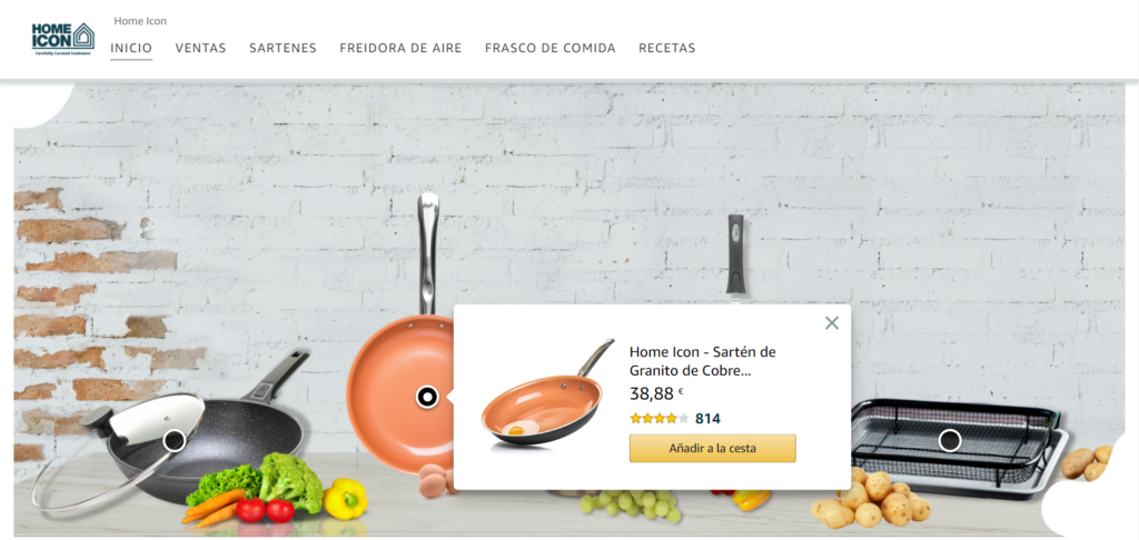
- Interactive shopping images or hotspots: This type of creativity allows to use an image containing up to 6 of your available products, pointing to each product with a “spot” or clickable point that allows you to buy or access the detail page. Ideally, use this image to show your products in a context, for example with a lifestyle image. This is a different and inspiring way to show your products on sale. You can also use this image to include complimentary products and encourage cross-selling.

- Simple rather than overloaded design: Prioritise the most important information you want to transmit and present it in a clear and simple way, accompanying the user in the process so it will be easier to find and understand. An overloaded design with too many images or text can cause the user to miss the key points you want to communicate.
In conclusion, it is not only important that your store reflects your brand image and looks visually appealing, but it is also crucial to consider the user experience to ensure that the consumer can easily find what they are looking for and to transmit the core values of your brand in a clearer way.
At Amazing we review our clients’ stores periodically, analysing the data provided by the platform itself and applying the learnings extracted periodically, also optimising them at key moments of the brand and on Amazon events.
Somos una agencia especializada en ayudar a los vendedores en Amazon en la gestión de marketing y publicidad.


